


Typing is one of those phone habits I rarely think about until the keyboard gets in the way. That is why Keyboard Emoji & Sound Themes caught my attention: it focuses on changing the part of the phone I use constantly, rather than adding another separate customization screen. After spending time with it, I see it as a personalization app for people who want their messages to look more expressive and their keyboard to feel less ordinary.
The central idea is simple. You install a keyboard, choose a visual style, use emoji more easily, and adjust the atmosphere around typing with themes and sound options. The app is free, aimed at Everyone, and comes from BUGUN SOFTWARE COMPANY LIMITED. Its store summary points to emoji, stylish fonts, and themes, but the practical question is whether those extras improve daily typing or merely make the keyboard more decorative.
My answer is that it works best when you treat it as a lightweight style change, not as a replacement for every keyboard feature you already rely on. It can make casual conversations more personal, especially if you enjoy matching your keyboard to your wallpaper or changing its appearance from time to time. However, people who care most about advanced writing tools, strict privacy controls, or a highly polished productivity workflow may prefer a more established general-purpose keyboard.
How the current version feels in everyday use
The current release is version 1.3.4, and the app has already attracted over one million installs. That gives it a meaningful user base for a relatively focused customization tool. Its average rating is 4.3 from around twelve thousand ratings, with hundreds of written reviews, so the overall reception is clearly positive without suggesting that every user will have the same experience.
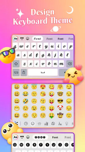
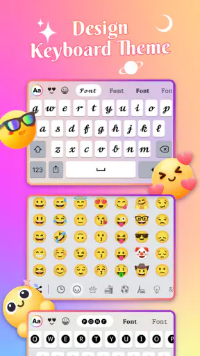
What I like first is the directness of the concept. Instead of opening a separate emoji app, copying symbols, and returning to a conversation, I can keep expressive characters within the typing flow. That matters most in quick chats, group conversations, comments, and social posts where tone is often carried by a small visual detail rather than a long explanation.
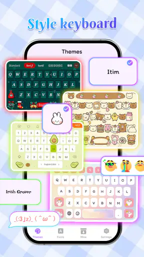
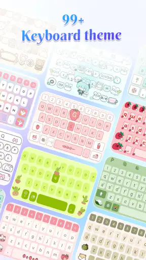
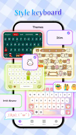
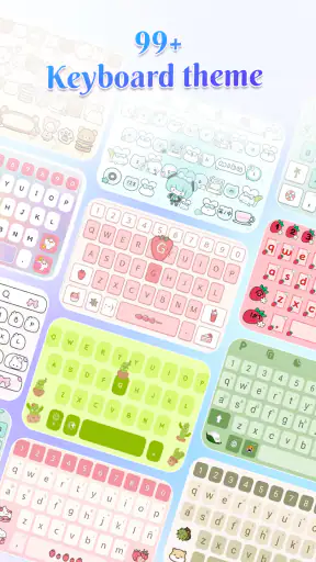
The theme side is more useful than it may sound. A keyboard occupies a large, familiar area of the screen, so even a modest visual change can make an older phone feel a little fresher. I found this especially appealing when the default keyboard looked too plain against a customized home screen. The change is not profound, but it is immediate and easy to notice.
The font-focused approach also suits people who enjoy experimenting with the presentation of their messages. There is an important distinction here: a stylish character set can be fun in a caption or a friendly message, but it is not automatically better for everything. Some decorative characters are less readable, may look different across devices, and can be unsuitable for work, school, addresses, or anything where clarity matters more than personality.
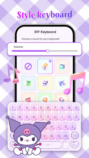
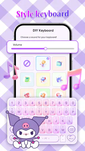
Sound themes are another detail that deserves a realistic expectation. A typing sound can make the keyboard feel more responsive, but it can also become distracting quickly. I would use a subtle option, keep it off in quiet places, and avoid treating sound as a permanent feature. The best keyboard sound is often the one that confirms a tap without competing with a conversation, video, or meeting.
A practical setup for a busy day
Imagine replying to a family group chat during a lunch break. You want to send a short message that feels warm rather than abrupt, so you use an emoji without leaving the conversation, select a readable visual style, and type normally. Later, you switch to a work chat. This is where restraint matters: I would return to the standard font style and keep the theme quiet, because a playful keyboard should not make professional writing harder to scan.
That small scenario reveals the app’s strongest everyday use. It is not about transforming every sentence. It is about giving casual typing a little more character while letting you decide when decoration is appropriate. Users who make that distinction will probably enjoy it more than people who expect every available style to be practical in every app.
One useful habit is to keep a conservative setup as your default and reserve more expressive styles for specific occasions. This avoids the common problem of choosing an attractive theme that looks good for five minutes but becomes tiring after a full day. It also makes switching back less frustrating when you need speed and legibility.
Where it differs from a usual keyboard
Compared with the keyboard that arrives with a phone, this app puts visual personality closer to the center of the experience. A standard keyboard generally prioritizes familiarity and basic efficiency. Keyboard Emoji & Sound Themes is more interested in how typing looks and feels. That difference makes it appealing to users who see the keyboard as part of their phone’s identity rather than a background utility.
Compared with a large, established keyboard built around prediction, multilingual writing, voice input, clipboard tools, and deep correction settings, this app has a narrower appeal. Its value is easier to understand if your main goal is customization. If you often write long documents on your phone, switch between several languages, or depend on sophisticated corrections, the usual productivity-oriented alternative may remain the better daily driver.
That does not make the app inferior; it makes the trade-off clearer. A focused personalization keyboard can be more enjoyable than a feature-heavy one when appearance and emoji access are your priorities. In return, you should be prepared to judge it by comfort and reliability rather than by the number of advanced writing tools it offers.
What the release details suggest about its direction
The app was released on January 27, 2026, and version 1.3.4 shows that it is already moving through early refinement rather than sitting at a first public build. I would read that as a sign of active development, but not as proof that every possible keyboard feature is already mature. A version number can show where the product is in its release path; it cannot replace hands-on testing of stability, compatibility, and long-term comfort.
For someone installing it today, the practical benefit of using the current version is straightforward: you get the developer’s latest available package instead of judging the app by its earliest state. Existing users should still approach updates with a little care. Keyboard changes can affect muscle memory, theme appearance, sound behavior, and the way a familiar layout feels, even when the visible update seems small.
I would therefore test a new update in ordinary conversations before depending on it for important work. Type a few sentences, use emoji, try the styles you actually like, and check whether the keyboard remains comfortable after several minutes. This is a better evaluation than tapping through a theme gallery once, because keyboards are judged by repeated use, not by a single attractive screenshot.
The developer, BUGUN SOFTWARE COMPANY LIMITED, has positioned the product clearly around expressive typing. That focus is helpful because it gives the app a recognizable identity. At the same time, the more specialized the identity becomes, the more important it is for future versions to preserve the basics: dependable key response, readable layouts, sensible switching, and a setup process that does not make users work too hard for a cosmetic change.
What changes mean for people already using it
Current users are likely to notice the most value when they revisit their setup rather than simply installing an update and forgetting about it. A new version is a good moment to ask whether the chosen font is still readable, whether sound is still welcome, and whether the theme fits the way the phone is used now. Personalization works best when it adapts to your routine instead of becoming another setting you never touch.
There is also a useful distinction between changing the keyboard and changing the messages themselves. A theme affects your typing environment, while decorative fonts affect what other people may see. I would be comfortable using a colorful keyboard every day, but I would use stylized characters selectively. That keeps the app fun without making every message look like a poster.
People who already use another keyboard should compare the switching cost honestly. Moving between keyboards can be annoying if you frequently change languages, rely on a particular correction habit, or have years of muscle memory built around one layout. In that situation, the app may be better as an experiment for casual use than as an immediate full replacement.
Android compatibility is reasonably broad because the minimum requirement is Android 8.0. That makes the app relevant to users who are not carrying the newest phone. Still, compatibility on paper is not identical to comfort on every device. Screen size, manufacturer software, and the way a phone handles keyboard selection can all influence the experience, so I would judge the result on the actual phone rather than assuming that one setup represents every Android model.
The gaps I would consider before switching
The first limitation is focus. The app’s strongest features are visual and expressive, so users searching for a complete writing assistant may find the experience less convincing than a keyboard designed primarily around speed and accuracy. If your day involves emails, forms, notes, and long replies, decorative options may matter less than prediction quality and correction behavior.
The second is readability. Stylish fonts can look excellent in a short message but become tiring in a long paragraph. Some characters may also be interpreted differently by recipients or displayed with a different appearance on another device. My advice is to use decorative text as an accent, not as the default language for everything.
Sound can create its own friction. It may feel satisfying at first, yet the same effect can become repetitive during rapid typing. It can also be inappropriate in a library, office, classroom, or shared room. A keyboard that looks good silently is more flexible than one that depends on audio feedback to feel interesting.
Another consideration is the trust involved in installing any third-party keyboard. A keyboard sits close to the text you enter, so I would only enable one after thinking carefully about whether I am comfortable using it for private conversations, passwords, payment details, and sensitive work. This is not a criticism unique to this app; it is a sensible rule for every keyboard that is not the phone’s original input tool. I would keep the standard keyboard available and switch back whenever the context demands extra caution.
These limitations do not cancel the app’s appeal. They simply define the right audience. It is a better fit for someone who wants a more playful typing surface than for someone who wants the most powerful writing engine available on a phone.
Small techniques that improve the experience
My first tip is to choose the theme after deciding how you type, not before. A dark, highly decorated background may look attractive in a preview but reduce contrast or make keys harder to distinguish during fast typing. Spend a few minutes typing a normal message, including punctuation and numbers, before committing to a style.
My second tip is to separate visual experimentation from important communication. Keep one familiar, readable configuration for banking, work, school, and forms. Use the more expressive fonts and emoji-heavy approach for chats, captions, and personal messages. This two-mode habit gives you the fun of customization without sacrificing clarity when it matters.
My third tip is to evaluate the sound theme in a real environment rather than with the phone in your hand at home. Try it while other people are nearby and while listening to audio. If the sound competes with everything else, turn it off and keep the visual theme. The app does not have to be used at maximum intensity to be worthwhile.
A fourth useful check is to test how quickly you can return to your previous keyboard. Before making the new setup permanent, learn the keyboard-switch control on your phone. That way, you are not trapped by an uncomfortable layout during a rushed message, and you can compare both options fairly instead of relying on memory.
Who should install it now
I would recommend giving it a try if you enjoy customizing your phone, use emoji often, and want the keyboard itself to match your personal style. It is also a sensible choice for people who find the default keyboard visually dull and would rather make a small, noticeable change than redesign the entire device.
It may suit younger users and casual communicators particularly well because the age rating is Everyone and the main appeal is easy to understand: make typing more expressive. Families should still encourage sensible keyboard habits, especially around private information and switching back to a trusted option when entering sensitive details.
I would skip it, or at least test it cautiously, if you depend on advanced writing assistance, need a highly specialized multilingual workflow, or dislike changing the keyboard you already know. The same applies if decorative fonts feel less readable to you or if typing sounds are distracting. In those cases, a conventional keyboard can be the more comfortable choice, even if it offers fewer visual options.
The free price lowers the barrier to trying it, which is important for an app whose appeal is so personal. You do not need to redesign your entire phone to find out whether the themes fit your taste. Install it, use a conservative style first, compare it with your current keyboard during a normal day, and decide based on comfort rather than the first impression.
My recommendation after using the current release
Keyboard Emoji & Sound Themes is best understood as a style-first keyboard with practical emoji appeal. It adds personality where most phones leave typing plain, and its current version gives existing users a reasonable point from which to reassess their setup. The combination of free access, broad Android support from Android 8.0 onward, and a large installed audience makes it easy to explore without much commitment.
I would not replace a trusted productivity keyboard blindly. Instead, I would use this app when the conversation is casual, the visual mood matters, and I want the keyboard to feel like part of the phone’s design. I would keep a familiar alternative ready for long writing, sensitive entries, and situations where predictability matters more than decoration.
Overall, I think the app earns its place for users who want customization that appears during an activity they already do all day. Its weaknesses come from the same focused design that makes it appealing: it is more about expression than deep writing control, and its most decorative choices require moderation. If you approach it with that trade-off in mind, the result is a pleasant way to make everyday typing more personal without expecting it to solve every keyboard problem.


